Brief
A school assignment.
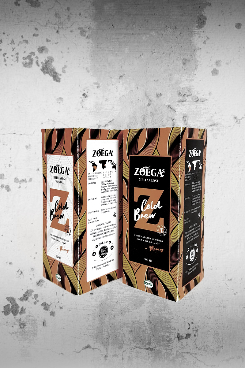
Zoégas wanted to launch a cold brew concept, and we needed to create a visual world, design and sustainable packaging solution for this.
3 products within the category ready-to-drink will come first, and over time other products will follow, such as ready-to-drink cold brew with milk and bean bags (like tea bags for coffee).
The design must be sustainable, eye catching, bold and different, without losing the connection to the Zoégas coffee brand.
My part
My main responsibility was the structural design, the digital mockups and the physical prototypes.
These are just like the paper cans you can see in many of the competing rivals, only it’s not round; it’s square.
Concept & Graphic Design
Zoégas’ african project Coffee by Women is already a thing, so we picked 3 women – who are part of the program and who’s interviews by influencers are on Youtube – to be front figures or ambassadors for each taste.
The pattern is inspired by african patterns and the lively colours you can see on some houses and clothing there. It’s soft and flowy, in order to meet the stiffness of the Zoégas logo and typography. The black labels are for the original taste, the white labels are for future products with milk.
Each character has her own taste and colour. On the front side there’s a quotation from her interview, and on the back there’s a longer one.
There’s Mercy …
Harriet …
… and Hellen:
Concept
Bean Bags
I also did the packaging for the future product with bean bags. The graphic design is basically the same, but the structural design is of course different. You can read about it here.


